MS PowerPoint Design Tips for Stunning Presentations
Introduction
Making a captivating PowerPoint presentation is more than just stuffing slides with text and images. A good presentation can captivate an audience, convey your message effectively, and make a memorable impact. Whether you’re delivering in a corporate boardroom, classroom, or online webinar, these MS PowerPoint design tips will take your presentations to the next level.
Start with a Strong Structure

Before you start designing slides, plan out your presentation structure. Arrange your material with a logical flow and a well-defined beginning, middle, and end. Provide the audience with an overview using agenda or outline slide. Organizing your slides allows your message to flow naturally and it helps keep your
attention. Simplicity of structure works better than trying to put too much info on a
Choose the Right Template
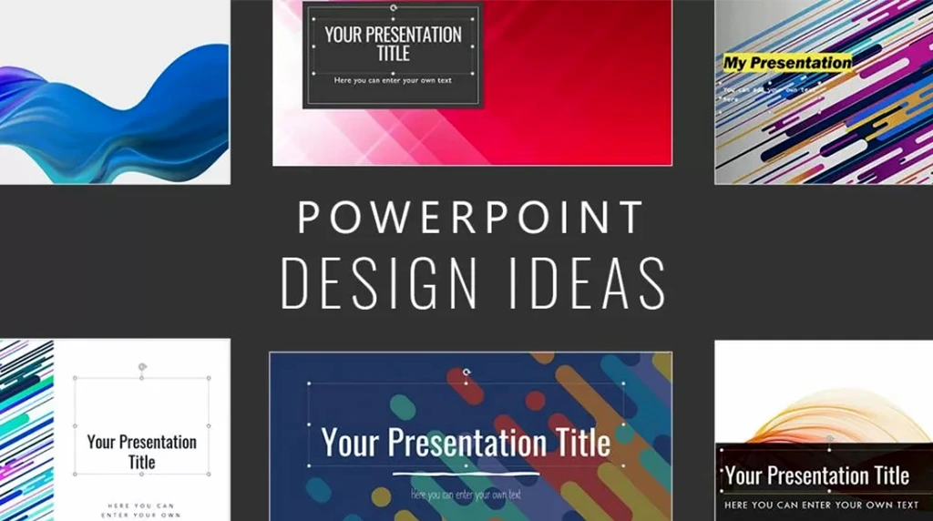
PowerPoint provides a variety of templates, but not all the templates are suitable for each presentation. Pick a template that is appropriate for your subject, your mood, and your spectators. For professionals, choose sleek, minimalist templates. Creative or informative presentations: templates with bright colours, interesting shapes or unusual layouts are more appropriate. Keep fonts, colors, and style of slides consistent throughout your presentation for a professional looking presentation.
Focus on Visual Hierarchy

Visual hierarchy directs the viewer’s attention to the critical components of a slide. Larger font sizes should be used for headings and smaller ones for body texts. Emphasize important information with bold or contrasting color text and make use of white space to prevent the slide from feeling too cluttered. A clear hierarchy helps attention is also guided with clear visual structure making slides instantly easier to read & comprehend. Don’t cramp too much text into a single slide; Follow the 6×6 rule. – Six bullet points, with six words each!
Use High-Quality Images and Graphics

Pictures, icons, and shapes can also help your slides look better and make them simpler to follow. Use high quality images that are pertinent to your topic. Don’t stretch or pixelate your images. Infographics and charts work well too, particularly for presenting complex data. Professional diagrams can be created by using tools such as PowerPoint SmartArt without the need for graphic design expertise. Always keep in mind, your visuals should enhance your message, not take away from it.
Limit the Use of Text
One of the most prevalent errors in presentations is cramming the slides with text. Slides are designed to support your talk, not serve as a stand-in for it. Be succinct with text and use short phrases or key words. Use bullet points rather than paragraphs and bold key words to make them stand out. This helps keep the audience focused on what you saying while giving them the opportunity to understand the slide quickly.
Choose Colors and Fonts Wisely
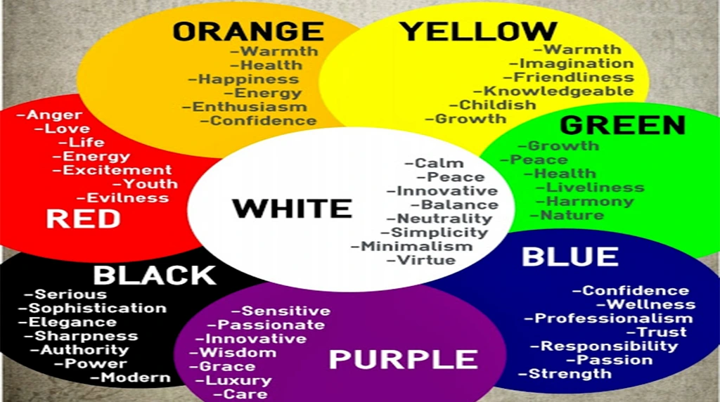
Colors and fonts affect how easily your audience can read and how your presentation looks. Limit yourself to 2-3 main colors that correspond with your brand or theme. Make sure there is enough contrast between the text and the background to be easily read. For fonts, select s=ans-serif ones such as Arial or Calibri to facilitate reading. Don’t go overboard with font types in a presentation. Matching color and font helps keep your slides looking professional.
Add Animations and Transitions Sparingly

Animations and slide transitions are a great way to make your presentation more dynamic, but too many can be distracting. Use subtle transitions such as Fade or Push and only animate to highlight key points. Stay away from flashy effects that could draw attention away from the essence of your message. Keep in mind, there is such a thing as too much smooth and minimal animations help keep your audience engaged without distracting them.
Practice and Refine Your Slides

Even the most beautifully designed slides require a good delivery. Practice your presentation for flow and timing. Verify alignment, consistency, and readability on every slide. Run the pitch deck on multiple devices to check if fonts and visuals are rendered as expected. Polishing your slides and practicing delivery allows for a professional, confident presentation with enduring effect.
Conclusion
Making an amazing PowerPoint presentation is an art and a science. Use these eight design rules of thumb to make slides that are beautiful, clear, and stick in your audience’s mind. Tip: focus on clarity, simplicity and relevance. A visually harmonious, well-organized presentation allows you to take your message from ordinary to mind-blowing and capture your audience, slide after slide.
1. What is the biggest mistake people make while designing PowerPoint presentations?
The most common mistake is adding too much text and using inconsistent fonts, colors, and animations. A great presentation should be clean, visually balanced, and easy to understand. Use the 6×6 rule, high-quality visuals, and plenty of white space. Your slides should support your speech—not replace it. A professional design instantly makes your presentation more impactful.
2. How can I make my PowerPoint presentation look professional without graphic design skills?
You don’t need to be a designer to create stunning slides. Use PowerPoint Designer, ready-made templates, icons, SmartArt, and modern fonts. Stick to 2–3 colors and maintain a consistent layout throughout the presentation. Simple transitions and meaningful visuals make your slides look polished while keeping your audience focused on your message.
3. Which PowerPoint features can instantly improve my presentation?
Some powerful features include Designer Ideas, Morph Transition, Zoom, Icons, SmartArt, and Animation Pane. These tools help you create interactive and visually appealing presentations without much effort. When used wisely, they can increase audience engagement, improve storytelling, and give your slides a premium, professional appearance.
4. How do I keep my audience engaged during a PowerPoint presentation?
Avoid reading directly from your slides. Instead, use visuals, short bullet points, charts, and real-life examples. Ask questions, include interactive elements, and maintain eye contact with your audience. A well-designed presentation combined with confident communication keeps viewers interested from the first slide to the last.
5. What are the top design tips for creating stunning PowerPoint presentations?
Focus on simplicity, consistency, and readability. Choose modern fonts, use high-resolution images, maintain proper alignment, and follow a consistent color theme. Avoid unnecessary animations and cluttered slides. Remember, every slide should communicate one clear idea. A clean, professional presentation not only looks attractive but also makes your message easier to understand and remember.