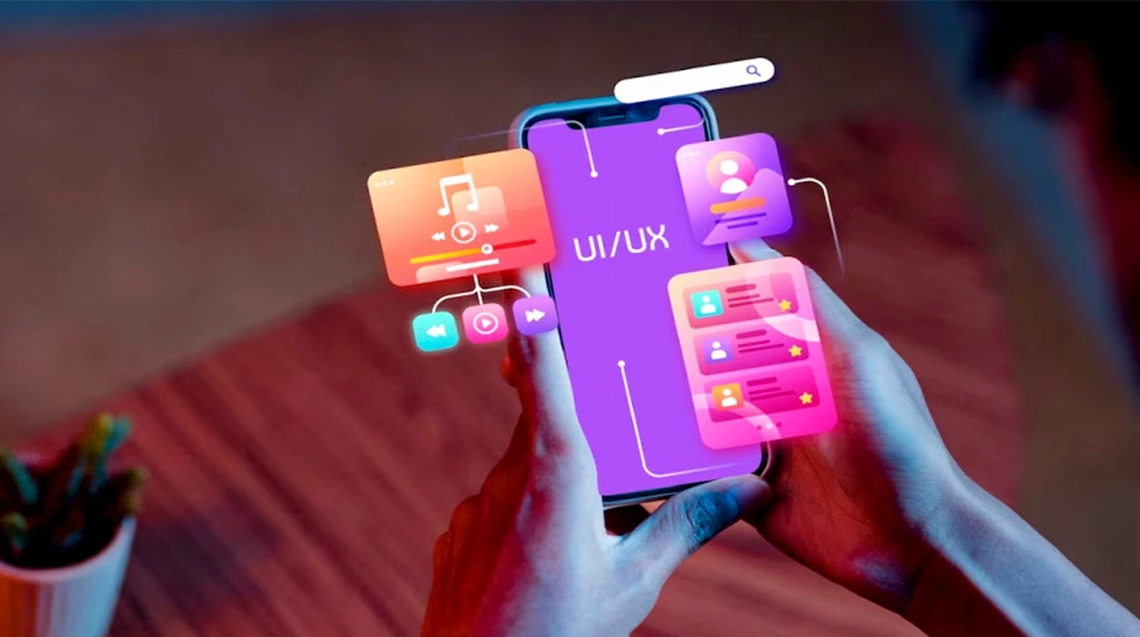
In today’s digital world, mobile devices have become the primary way many people access websites, apps, and digital content. This shift means graphic designers and developers need to ensure that images and visuals look great and perform well on smartphones and tablets. Optimizing graphics for mobile devices isn’t just about making images smaller; it requires careful balancing between quality, load speed, and user experience.
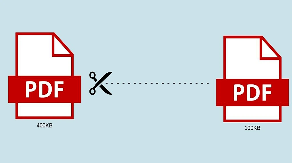
One of the most important factors when optimizing graphics for mobile is file size. Mobile networks can vary widely in speed and reliability, so large images can lead to slow loading times and frustrated users. To avoid this, designers should compress images effectively. Tools like Tiny PNG, JPEG mini, or Image Optim reduce file sizes without significant quality loss. Using the right file format is also essential: JPEG is great for photographs, PNG works well for images with transparency, and SVG is perfect for logos or icons since it scales infinitely without losing clarity.
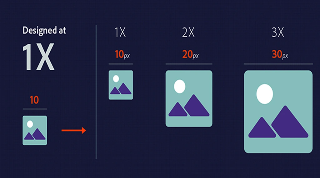
Optimizing Image Resolution for High-Density Mobile Screens
Another key aspect is image resolution. Mobile devices have smaller screens but often feature high pixel densities (like Retina displays). This means images need to be sharp and clear without being unnecessarily large. A common approach is to provide multiple versions of each image at different resolutions (e.g., 1x, 2x, and 3x) and use responsive design techniques to load the appropriate version depending on the device. This ensures visuals look crisp while keeping data usage minimal.
Responsive Scaling and Cropping for Flexible Mobile Layouts
Scaling and aspect ratio play a big role in how images appear on various screen sizes and orientations. It’s important to use flexible layouts that allow images to resize proportionally. Techniques like CSS’s max-width: 100% help images adapt fluidly within their containers. Additionally, cropping images thoughtfully ensures important visual elements stay visible on smaller screens. Tools like focal point cropping can automatically adjust what part of the image remains centered and visible regardless of screen size.
When designing graphics, simplicity is often better for mobile. Complex, detailed visuals can become cluttered or hard to see on small screens. Flat designs, bold shapes, and clear lines improve readability and user interaction. Designers should prioritize key elements and avoid overwhelming users with too much information in a single image.
Performance optimization also means leveraging modern web technologies. Using image lazy-loading techniques defers the loading of images until they’re actually needed on the screen. This speeds up initial page load and saves mobile data. Webp is another modern image format that offers excellent compression and quality but isn’t supported by all browsers yet. Providing fall back options ensures compatibility.
Balancing Animation and Performance on Mobile Devices
Animations and interactive graphics on mobile require careful consideration. While animated SVGs or lightweight CSS animations can add engagement without heavy file sizes, complex animations or video backgrounds may negatively impact performance. Designers and developers should test these elements thoroughly on actual mobile devices to strike the right balance between aesthetics and speed.
Accessibility should never be overlooked. Optimized graphics must have appropriate alternative text (alt text) so screen readers can describe images to visually impaired users. Contrast ratios should meet accessibility standards to ensure text and graphics are easily distinguishable.
Finally, testing is critical. Designers should preview their graphics on a range of devices, screen sizes, and connection speeds. Tools like Google Lighthouse or Web Page Test provide insights into image load times and overall performance. Gathering feedback from real users helps identify issues that automated testing might miss.
In conclusion, optimizing graphics for mobile devices is a multi-faceted process. It involves reducing file sizes through compression, choosing the right formats, creating responsive and flexible layouts, simplifying designs, and embracing new technologies. Above all, the goal is to provide a fast, visually appealing experience tailored to the unique demands of mobile users. By following these best practices, designers can ensure their visuals look great, load quickly, and contribute to a seamless user experience on any mobile device.
1. Why do we need to optimize graphics for mobile devices?
Mobile phones have smaller screens, slower internet, and less battery compared to laptops. If your graphics are too heavy, they load slowly , use more data , and drain battery . Optimized graphics load fast, look sharp, and give users a smooth experience without lag.
2. What is the best image format for mobile apps and websites?
Answer: It depends on the type of graphic:
WebP or AVIF→ Best for photos. 30-50% smaller than JPG with same quality
PNG→ Use only when you need a transparent background
SVG→ Best for logos, icons, and illustrations. Scales to any size without blur Student Tip: Avoid BMP and TIFF on mobile. They’re too heavy.
3. What image size should I use for mobile screens?
Don’t upload 4000px images for a 400px screen. Rule: Make images max 2x the size they’ll display at. Example: If your image box is 300px wide on mobile, export it at 600px max. This keeps it sharp on high-resolution phones but still lightweight. Tools to resize: Photoshop, Canva, Squoosh, TinyPNG
4. How can I reduce image file size without losing quality?
Use these 3 tricks:
Compress it→ Tools like TinyPNG, ImageOptim, or Squoosh reduce KBs without visible quality loss.
Use correct resolution→ 72 DPI/PPI is enough for screens. 300 DPI is only for printing.
Remove extra data → Delete hidden metadata, layers, and unused colors. Target: Try to keep hero images < 150 KB and icons < 20 KB.
What is “responsive image” and why is it important for mobile?
Responsive images automatically show a smaller version to mobile users and a larger one to desktop users. In HTML/CSS you do this with srcset or <picture> tag. Why it matters: A mobile user shouldn’t download a 2MB desktop banner. They get a 200KB version instead = 10x faster loading Result: Better Google ranking, happy users, less bounce rate.