Understanding Negative Space in Graphic
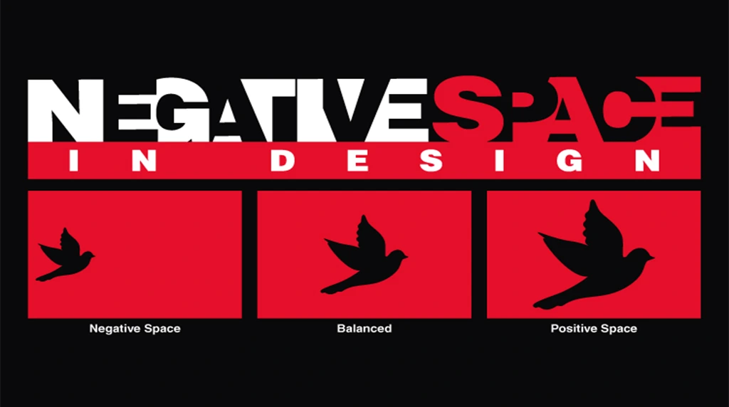
The Importance of Negative Space in Design
While it may seem like “empty” space, it plays a critical role in shaping the overall composition and enhancing visual clarity. In graphic design, negative space helps guide the viewer’s eye, emphasize key elements, and create balance within the layout. It allows content to “breathe,” reducing visual clutter and improving readability.
Practical Uses of Negative Space in Design
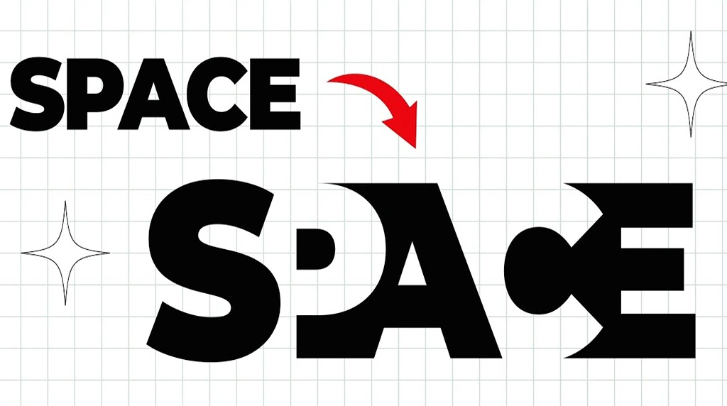
For example, a logo that cleverly incorporates negative space—like the FedEx logo with its hidden arrow—can communicate messages in subtle and powerful ways. In editorial design, ample white margins and spacing between lines of text make reading more comfortable and engaging. Similarly, in advertising, using space around a product image or slogan can make the message stand out more effectively.
Negative Space Beyond Minimalism

Negative space is not limited to minimalistic design; it’s about contrast and hierarchy. Even in bold, complex compositions, skillful use of spacing can help organize content and enhance aesthetic appeal. It’s also an essential tool in responsive and web design, where spacing must adapt to various screen sizes while maintaining usability.
Conclusion
Ultimately, mastering negative space requires thoughtful planning. It’s not about removing content, but about using absence to support presence. By understanding and applying negative space effectively, designers can create visually appealing, functional, and emotionally resonant designs that communicate more with less.
1. What exactly is negative space in graphic design?
Negative space, also called white space, is the empty area around and between the main subjects of a design. It’s not always white — it can be any color or texture. While positive space is your logo, text, or images, negative space gives them room to breathe. Think of the FedEx logo: the hidden arrow between ‘E’ and ‘x’ is created entirely by negative space. It’s a powerful tool for clarity and balance.
2. Why is negative space important for my brand or design?
Negative space improves readability, guides the viewer’s eye, and creates a premium, uncluttered look. Busy designs overwhelm users and dilute your message. Strategic white space makes key elements like CTAs or headlines stand out instantly. It also conveys sophistication — luxury brands use lots of negative space because it feels intentional and high-end. Good negative space = better user experience and stronger communication.
3. Is negative space just “empty space” that’s wasted?
No. Negative space is an active design element, not wasted area. It shapes how people interpret your layout. Micro negative space (small gaps between letters, lines, icons) improves legibility. Macro negative space (large margins, padding around blocks) creates focus and visual hierarchy. Designers plan it deliberately to reduce cognitive load and make content scannable. Empty doesn’t mean purposeless.
4. How can I use negative space to make my design more creative?
Use it to create dual imagery or hidden meanings, like the World Wildlife Fund’s panda formed from negative space. You can also use negative space to imply shapes, direct movement, or frame important content. Try increasing margins, line-spacing, or letter-spacing instead of adding more graphics. Sometimes removing elements makes the design stronger. Ask: “What can I take away to make this clearer?”
5. What’s the biggest mistake designers make with negative space?
Overcrowding. The urge to fill every inch with text, icons, or color kills impact. Another mistake is inconsistent spacing — uneven gaps feel messy and unprofessional. Always align elements to a grid and be intentional with margins. Remember: negative space should support your message, not compete with it. When in doubt, simplify.