How to Create Professional Presentations in PowerPoint
Introduction
Preparing professional PowerPoint presentation is an art that can provide an everlasting impression to your audience. Regardless of whether you are a student or educator or a business person, your presentation must not just present information but must also be able to connect, convince and motivate. There is a great deal of tools and features that can be used to create powerful slides in power point, although when not utilized effectively they can create less impressive slides. This blog will discuss eight points in order to enable you to make presentations in PowerPoint professionally.
Start with a Clear Purpose

Work out your purpose of presentation before opening PowerPoint. Ask yourself: What do I want my audience to know, experience or take action? Having a clear purpose will make your slides remain relevant and focused. To illustrate, in the case of a business pitch presentation, it is supposed to point out the issues, solutions and benefits whereas in an academic lecture it may be devoted to an explanation of concepts with the help of images. Once you have the purpose, you will be able to structure your content in a logical way and eliminate irrelevant mess.
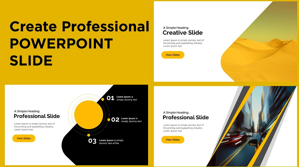
Use a Consistent Design Theme

First impressions matter. A professional presentation must appear to be refined and unified. PowerPoint has inbuilt templates, however, you are able to personalize your theme with matching fonts, colors and structures. Select fonts that can be read such as Arial, Calibri, or Helvetica and make use of 2 or 3 colors that can be associated with your brand or subject matter. The use of fonts and styles should not be overdone as they may distract the audience. A consistent design is concerned with attention to detail and professionalism.
Keep Slides Simple and Focused

The biggest error that presenters commit is that they overload slides with text. Keep in mind the rule one idea to the slide. Provide a summary of main information not using long sentences. Images, symbols, and graphs are superior to long texts. Limited slides are simpler to understand and ensure your audience gives attention to what you are saying rather than reading all the information. This is because simplicity makes your message clearer and stronger.
Use High-Quality Visuals

A picture is a thousand words, particularly in presenting. Use infographics, graphics, charts, and pictures to make a point. Make sure that your visuals are of good quality and are related to the information. The SmartArt and the chart features included within PowerPoint allow presenting the data in an attractive manner with ease. To be the most effective, you should not use any generic stock pictures. You should use pictures that resonate with your audience. Your presentation can be memorable and interesting because of well-selected visuals.
Pay Attention to Typography and Readability
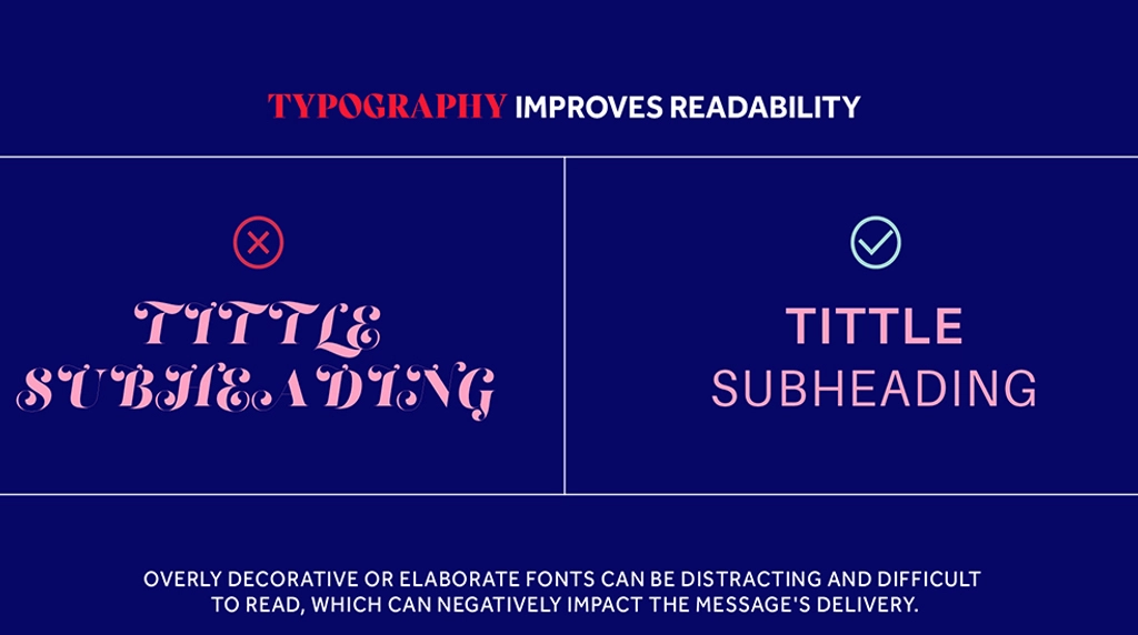
Even at the back part of a big room, your audience should read your slides without any problem. Use big font sizes (at least 24pt in body text and 36pt in headings). Text and background colors should be contrasting, e.g. dark text n light background or the other way round. Use fonts that are difficult to read. Typography: Your slides will appear clean and professional due to consistency.
Add Smooth Transitions and Animations (Sparingly)
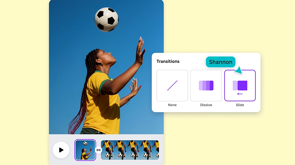
PowerPoint has a lot of transitions and animation effects and their excessive use can render your presentation unprofessional. Simple transitions such as Fade and Wipe are to be used so as to maintain the flow. In the case of animations, use them, but only when they can bring value to the animation such as the revealing of bullet points one by one to maintain focus. Do not use any flashy effects such as turning text or bouncing objects since they can be distracting and lessen credibility. There are subtle animations that are not excessive.
Practice Good Data Presentation

When you have numbers or the findings of your research in your presentation, present them in a simple and understandable way. Spreadsheets should not be put on slides instead make use of charts, graphs, and diagrams. Bold colors or callouts highlight the important figures and explain to the audience what to pay attention to. Transform complicated information into consumable images. It is worth remembering that it is not supposed to bombard your audience with figures but to convey insights.
Rehearse and Prepare for Delivery

A good PowerPoint presentation does not only pertain to the design, but also to delivery. You can rehearse your presentation a number of times to become familiar with the flow of slides. Presenter View in PowerPoint is used so that you can see your notes and the audience sees the slides only. Ensure that your timing is within the available time. Besides, be prepared technically, that is, test the projector, the laptop, or the remote. Prepared and confident presentations have more effect compared to well designed slides.
Conclusion
To serve a professional PowerPoint presentation, it is not enough to fill slides with texts and pictures. It is regarding the art of making a clear statement, being consistent in design, making the content simple and being a confident presenter. With these eight tips in mind purpose definition, consistent theme, simple slides, visuals, readability, smooth animations, presentation of data and rehearsing, you can make presentations that actually resonate with your audience.
FAQs - How to Create Professional Presentations in PowerPoint
1. What layout principles make a PowerPoint slide look professional?
Professional slides prioritize clarity over decoration. Start with the 6×6 rule: no more than 6 bullet points per slide, 6 words per bullet. This forces you to distill ideas and prevents text walls that audiences won’t read. Use grid alignment and consistent margins so elements line up. PowerPoint’s Align and Guides tools help maintain visual order.
Stick to one idea per slide. If you’re explaining a process, break it into multiple slides instead of cramming. White space isn’t empty – it directs attention. Increase spacing between elements so the eye can rest.
For hierarchy, make titles 32-44pt, body text 18-24pt, and never go below 18pt for readability in a room. Use bold or color to highlight the key takeaway, not to decorate everything. A professional slide answers the question, “What should the audience remember in 3 seconds?” before you click next.
2. How do I choose fonts and colors that look corporate and credible?
Limit yourself to 2 fonts and 3 main colors. For fonts, pair a sans-serif header like Calibri, Segoe UI, or Helvetica with a readable body font. Avoid decorative fonts like Comic Sans or script styles in business contexts – they undermine credibility. Embed fonts if sharing the file via Save As > Tools > Save Options so they don’t break on other PCs.
For color, use your brand palette or choose a high-contrast scheme. Dark text on a light background is safest for projectors. Use the Eyedropper tool to pull exact colors from a logo. Then apply the 60-30-10 rule: 60% dominant neutral like white or dark blue, 30% secondary color, 10% accent for callouts.
Check accessibility with Review > Check Accessibility. Aim for a contrast ratio of 4.5:1 or higher. Consistent fonts and colors across slides signal attention to detail, which audiences equate with professionalism.
3. Should I use PowerPoint templates or build slides from scratch?
Templates save time, but customize them to avoid looking generic. Start with PowerPoint’s Design Ideas or a premium template, then modify the Slide Master under View > Slide Master. This sets fonts, colors, logo placement, and footers globally so you don’t fix each slide.
Delete template slides you don’t need. Audiences notice when every company uses the same “gradient wave” theme. Replace stock photos with your own images or use Insert > Pictures > Stock Images and filter for authentic-looking shots.
If building from scratch, set up your own master first: define title layouts, section dividers, and content layouts. Save it as a.potx file for future use. Pro tip: Create a “blank” master with just your logo and font rules. Templates are a starting point, not the final product. Professionalism comes from consistent branding, not from using the default design unchanged.
4. How can I use visuals, charts, and icons without cluttering my slides?
One strong visual beats four mediocre ones. Replace bullet lists with visuals when possible. To show a process, use SmartArt > Process instead of text. For data, simplify charts: remove gridlines, legend, and decimal points if they don’t add insight. Highlight the one bar or line that matters with an accent color; make everything else gray.
Use Insert > Icons for scalable, clean symbols instead of clipart. Keep icon style consistent – all line icons or all filled, not mixed. If using photos, apply Picture Format > Crop > Aspect Ratio > 16:9 so they fill widescreen slides, then add a subtle transparency overlay so text remains legible.
Follow the “squint test”: blur your eyes and if anything distracts from the main message, remove it. White space around charts and images makes them look intentional. Remember, professional slides use visuals to prove a point, not to fill space.
5. What delivery and file setup tips make my presentation run smoothly?
Prep the file so tech doesn’t sabotage your delivery. Use Slide Show > Set Up Slide Show > Show type: Presented by a speaker and check Use Presenter View. This gives you notes, next slide, and a timer on your screen while the audience sees only the slide. Practice with Rehearse Timings to stay on pace.
Keep file size down: File > Compress Pictures > Delete cropped areas. Embed video with Insert > Video > This Device and choose Playback > Start Automatically for seamless demos. Always have a PDF backup via File > Export > Create PDF/XPS in case fonts or videos fail.
Name your file with version and date: ClientName_Deck_V3_16Jun2026.pptx. On presentation day, use Slide Show > From Beginning shortcut F5, and learn B for black screen or W for white screen to regain attention. Professional delivery is 50% design, 50% reliability – test on the actual projector beforehand.