Understanding Visual Hierarchy in Graphic Design
Introduction
In graphic design, designing a good layout goes beyond just applying colors and fonts and using images — it’s about leading the eye and making it so that you the viewer knows what to look at. Enter: visual hierarchy. Visual hierarchy is the organization of the elements of design (color, size, contrast, alignment, proximity, whitespace, texture, and shape) in a way that conveys which are most important. Properly executed, it catches eye, enhances readability and strengthens the communication process.
What is Visual Hierarchy?
Hierarchy is the ordering of elements from broad to narrow, or general to specific, so that users can recognize a product’s visually most important parts first. In a poster, for example, the title needs to catch the eye before the smaller details such as date and contact details. In this way, the information is ensured to be provided in a natural and logical way, and viewers’ confusion will be decreased and comprehension increased.
The Role of Size and Scale
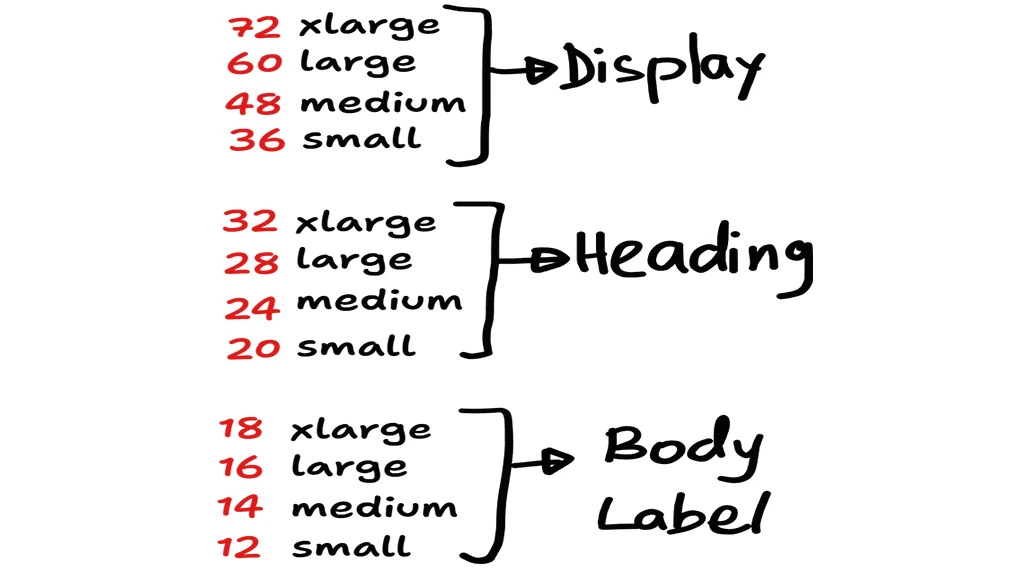
Scale allows us to create hierarchy and size is one of the best ways to do so. Larger things tend to attract more attention than smaller things, and so will be looked at first, even before you read them. Designers tend to employ larger font sizes for headlines and subheads and smaller font sizes for body text to contribute to the perception of order. In the same way you can also tell a central image is more important by making it bigger than the supporting images. and give the audience a clear understanding of what they need to know.
Importance of Color and Contrast
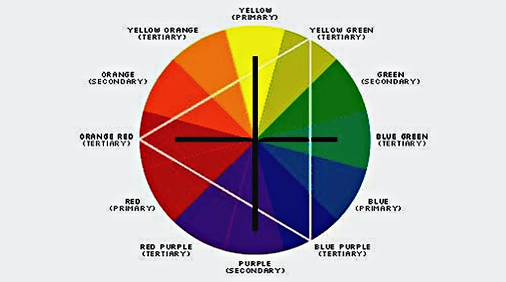
Colors are very important for attracting attention. Bold, bright, or contrasting colors can be used to draw attention to important areas, and softer colors can be used to fade background less important areas. For instance, a red call to action button on a white or gray website background really pops. Contrast in brightness, hue, or saturation helps keep things from merging and helps keep them legible.
Typography and Font Choices
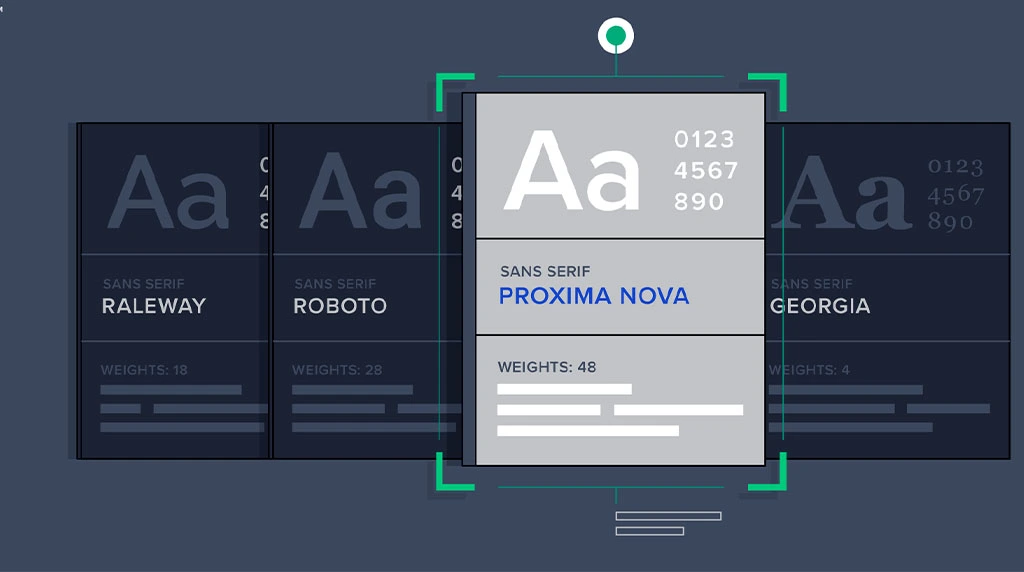
Typography conveys more than words—it creates emphasis. Headlines may be in bold type or a different typeface, while body text is in a single typeface and kept simple and legible. Designers apply other forms of variation such as italics, capitalisation or weight to highlight specific words. Good typographic hierarchy tells the reader: what to read first, what to skim over later.
Layout, Alignment, and Positioning
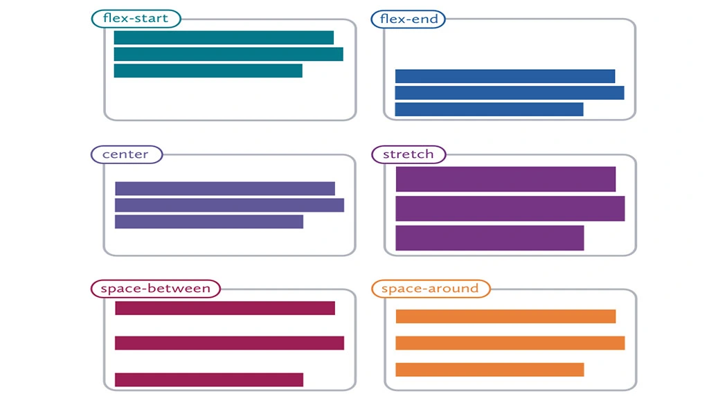
Placement of an element has a significant impact on its visibility. People’s eyes tend to scan a page in predictable patterns such as the Fpattern with a web page and Z pattern when applied to posters. Designers work these patterns to their advantage by positioning important information in these high-attention areas. Good alignment also provides a sense of order, so the entire design looks professional and is easy to follow.
Using White Space (Negative Space)
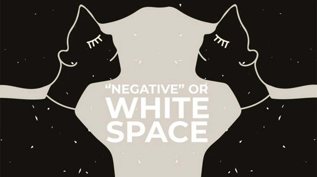
White space, or negative space, is the space around the elements. Rather than cramming a layout, introducing white space emphasises key elements and makes them stand out. For instance, a slick product ad with plenty of white space surrounding the product draws more attention than a busy layout with several visuals.
Visual Flow and Direction
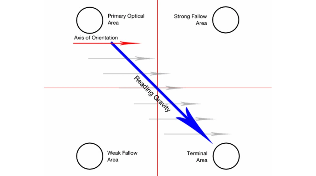
Design is not a fixed state — it directs a flow in the viewer’s eyes. Arrows and lines, or the path that a person’s gaze follows naturally in a photo, can all help point your audience’s gaze to the next bit of information. A good flow is designed so a viewer moves from headline to supporting image, then to call-to-action with no confusion.
Consistency and Balance
Hierarchy itself is is vital, but so is consistency. If all elements are fighting for your attention your message is lost. Balance is when you can have some things stand out and other things harmonize with them. Uniformity in fonts, colors, spacing Etc. leads to a cohesive look which results in a finished professional design.
Conclusion
Visual hierarchy isn’t just an art principle — it’s a tool of communication. With a thoughtful combination of size, color, type, position and flow, designers can make sure their message is heard loud and clear. Be it a website, an ad, or a social media post, using visual hierarchy allows you to craft designs that are both aesthetically pleasing and practical.
1. What is visual hierarchy in graphic design?
Visual hierarchy is the arrangement of design elements to guide viewers’ attention in a specific order. It uses size, color, contrast, spacing, typography, and layout to make the most important information stand out first, improving communication and user experience.
2. Why is visual hierarchy important in graphic design?
Visual hierarchy helps users quickly understand a design by directing their eyes to key information first. It improves readability, increases engagement, enhances user experience (UX), and makes posters, websites, advertisements, and social media graphics more effective.
3. What are the key principles of visual hierarchy?
The main principles include:
- Contrast
- Size and Scale
- Typography
- Color
- Alignment
- Spacing (Whitespace)
- Proximity
- Balance
- Repetition
- Composition
Using these principles correctly creates professional and visually appealing designs.
4. How can beginners improve their visual hierarchy skills?
Beginners can improve by practicing layout design, using clear typography, maintaining proper spacing, creating strong contrast, studying professional designs, and learning design software like Adobe Photoshop, Illustrator, Canva, and Figma. Regular practice helps develop a better eye for design.
5. Where is visual hierarchy used in graphic design?
Visual hierarchy is used in website design, social media posts, YouTube thumbnails, logos, posters, brochures, presentations, mobile apps, advertisements, packaging, and branding. It ensures that viewers notice the most important message first, leading to better communication and higher engagement.