How to Make Your WordPress Website Mobile-Friendly
Introduction
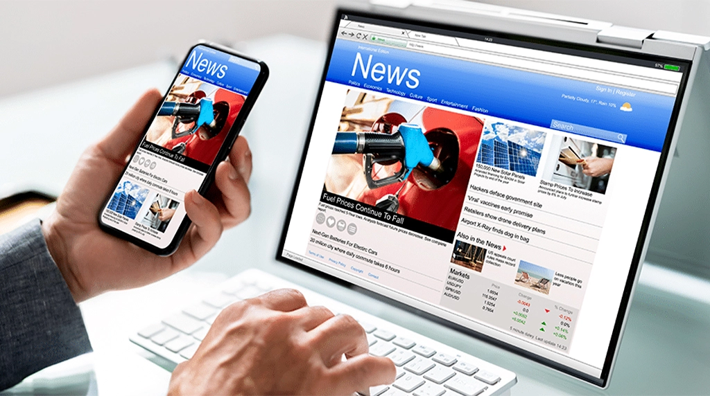
In today’s world of digital media, the majority of people access websites from their smartphones. If your WordPress site isn’t mobile-friendly, you could be missing out on a massive amount of traffic, leads, and even sales. A mobile-responsive design means your website can adapt to all screen sizes seamlessly to provide a great user experience.
Choose a Responsive WordPress Theme
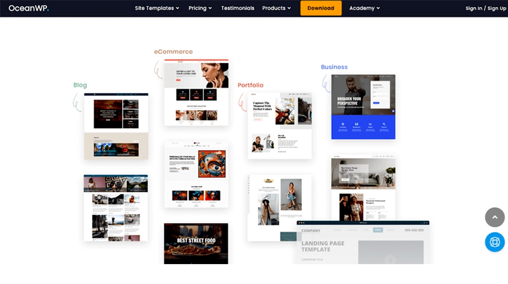
The basis of a mobile-friendly website starts with a responsive theme. A lot of modern WordPress themes are brought into an adaptive mode for different screen sizes automatically. When choosing a theme, ensure it iѕ mobile-optimized, lightweight and fast-loading. Popular responsive themes like Astra, GeneratePress or OceanWP there are no questions answers.
Use Mobile-Friendly Plugins

Certain plugins may cause a slowdown of your website or make display problems in smaller screen size. Test your plugins on mobile devices before you integrate them fully. Also, take advantage of any plugins to improve mobile responsiveness – WPtouch is a great example, which makes a straightforward mobile version of your site that doesn’t interfere with your desktop design.
Optimize Images for Mobile
High resolution images may slow down your site on mobile phones. Use image compression plugins such as Smush or ShortPixel to compress images without sacrificing quality. In addition, use modern formats like WebP to speed up load time. The responsive image feature in WordPress makes sure that a visitor gets served the most appropriately sized image based on their device.
Simplify Navigation

Mobile users want fast and easy browsing. Instead of complicated menus, use simple dropdowns or a hamburger menu. Limit the items in your menu to the essential pages and make your clickable buttons large enough for thumb navigation. It allows visitors to quickly find what they need without getting frustrated.
Improve Page Speed
Speed is important for mobile users. A minor delay of a few seconds can result in increasingly high bounce rates. To make your site load faster:
Use caching plug-ins such as WP Rocket or W3 Total Cache.
Minify CSS, JavaScript and HTML.
Enable a content delivery network (CDN) .
Buy a good web host.
Too fast loading websites are known to enhance users experience and increase rankings on search engines.
Prioritize Readability

Readability is essential on small screens. Choose a clean font, line height and letter spacing, and a font size of 16px or higher. Split up large blocks of text into smaller sections and use headings, bullet points and white space. This formats your content so it’s easy to skim and digest while you are mobile.
Test Your Website on Different Devices
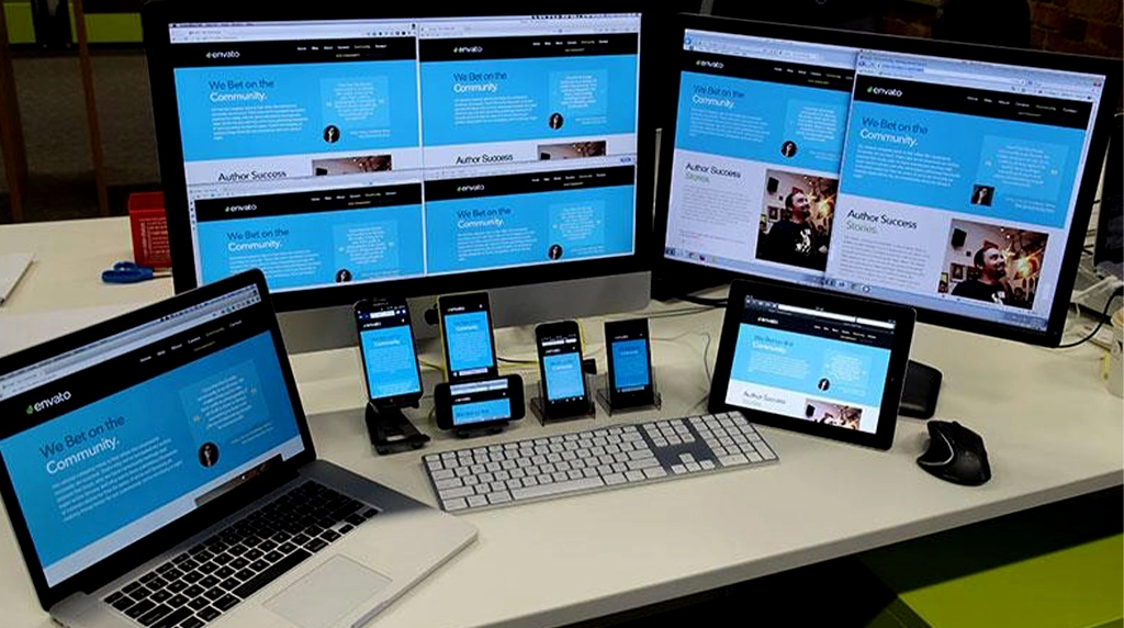
Don’t assume your site looks good on all phones. Use services such as Google’s Mobile-Friendly Test or BrowserStack to test your site on various devices and browsers. Running tests regularly lets you catch design or function problems before users experience them.
Implement Accelerated Mobile Pages (AMP)
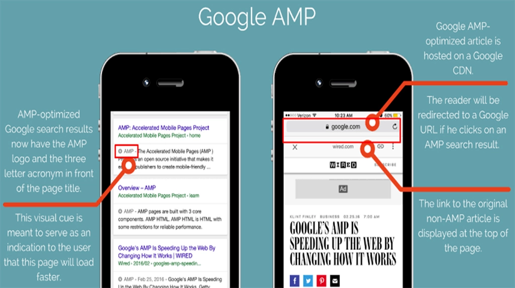
AMP is a Google-supported initiative that formats pages so they load faster for mobile users. Turning on AMP for WordPress with plugins like AMP for WP lets you radically increase your site’s load speed and make it more attractive to both mobile users and search engines.
Conclusion
Teaching Your WordPress Site to Be More Mobile-Friendly is Not an OptionAny more—It’s a Must-Have With Now Most Traffic Is from Mobile Now it’s Even More Important to Make Your Site Mobile-Friendly for More Engagement, Better Rankings and More Conversions Make Use of Considerate Mobile Features within your Chosen Theme Should you opt for a responsive theme, simplify the navigation, optimize the images and increase the speed, you coreate a smooth experience for your visitors regardless of device.
FAQs: How to Make Your WordPress Website Mobile-Friendly
1. Why is making a WordPress website mobile-friendly so important?
A mobile-friendly WordPress website provides a smooth browsing experience for users on smartphones and tablets. Since most internet traffic now comes from mobile devices, Google also prioritizes mobile-optimized websites in search rankings. A responsive website loads faster, improves readability, reduces bounce rates, and increases user engagement. Whether you’re running a business, blog, or e-commerce store, mobile optimization helps attract more visitors, improve conversions, and build trust with your audience.
2. How can I check if my WordPress website is mobile-friendly?
Start by opening your website on different smartphones and tablets to check its appearance and usability. Test navigation menus, buttons, images, and forms to ensure they work correctly. Also, use your browser’s responsive mode to preview various screen sizes. Monitor page loading speed and readability without zooming. Regular testing after updates helps identify issues early and ensures your website consistently delivers a seamless mobile experience for every visitor.
3. What are the best ways to improve mobile responsiveness in WordPress?
Choose a responsive WordPress theme that automatically adjusts to different screen sizes. Compress images, enable caching, and reduce unnecessary plugins to improve loading speed. Use mobile-friendly fonts, larger buttons, and proper spacing for better usability. Keep menus simple and avoid pop-ups that block content. Regularly update WordPress, themes, and plugins to maintain compatibility and performance. These practices create a faster, cleaner, and more engaging mobile browsing experience.
4. How does mobile optimization improve SEO and website performance?
Google uses mobile-first indexing, meaning it primarily evaluates the mobile version of your website for search rankings. A fast, responsive website improves user experience, increases session duration, and reduces bounce rates. Optimized images, clean code, and responsive layouts also enhance loading speed, which is another important ranking factor. Better mobile performance not only boosts SEO but also increases traffic, customer satisfaction, and conversion rates over time.
5. What common mistakes should I avoid when making my WordPress website mobile-friendly?
Avoid using oversized images, slow-loading plugins, tiny fonts, and buttons that are difficult to tap. Don’t overcrowd pages with excessive content or intrusive pop-ups that interrupt the user experience. Ensure forms are easy to complete on mobile devices and navigation remains simple. Regularly test your website after updates to catch display or functionality issues. Eliminating these common mistakes creates a professional, user-friendly website that performs well on every device.