How Colors Influence Graphic Design and Brand Identity

Join Graphic Designing + AI Course
Introduction
Color is more than just a visual element in graphic design; it has an emotional impact, sends a message and can influence the perception of a brand. The decision on which colors to use can affect the way a brand is remembered, the way a message is received and even the way consumers feel about a certain product or service. In this blog post, we discuss the role of color in graphic design and brand identity in 8 points.
Psychology of Colors
Join Graphic Designing + AI Course
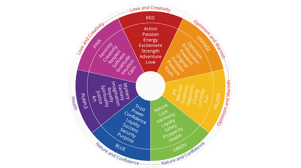
Every color has its own associated feelings and psychological responses. For example:
Red represents energy, passion and action, yet is also associated with danger and warning. It is used in fast food logos such as McDonald’s because it promotes hunger.
Blue says trust, calm, and dependable! IBM and Facebook are two big companies who use Blue to inspire trust.
Green is the color of growth, nature and renewal and is therefore a very popular choice amongst sustainable and green brands.
With knowledge of color psychology, designers are better equipped to select colors that align with a brand’s message and audience.
Building Brand Recognition
Join Graphic Designing + AI Course
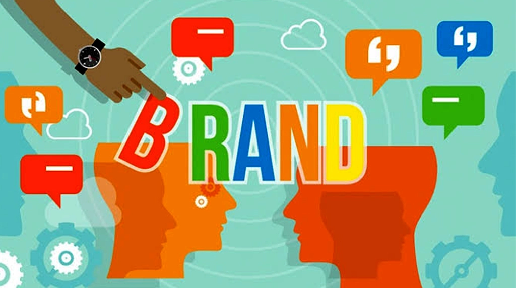
Colour is a big part of brand recognition. Estimates say up to 90 percent of first product assessments are made on colour alone. Using the same color in a company’s logo, packaging, website and advertising also makes a brand more identifiable. Think of Coca-Cola’s red or Tiffany & Co.’s signature blue — these colours immediately conjure up the brand in people’s heads.
https://www.youtube.com/watch?v=DMrr2gCOQcQ&t=2s
Setting Brand Personality
Join Graphic Designing + AI Course
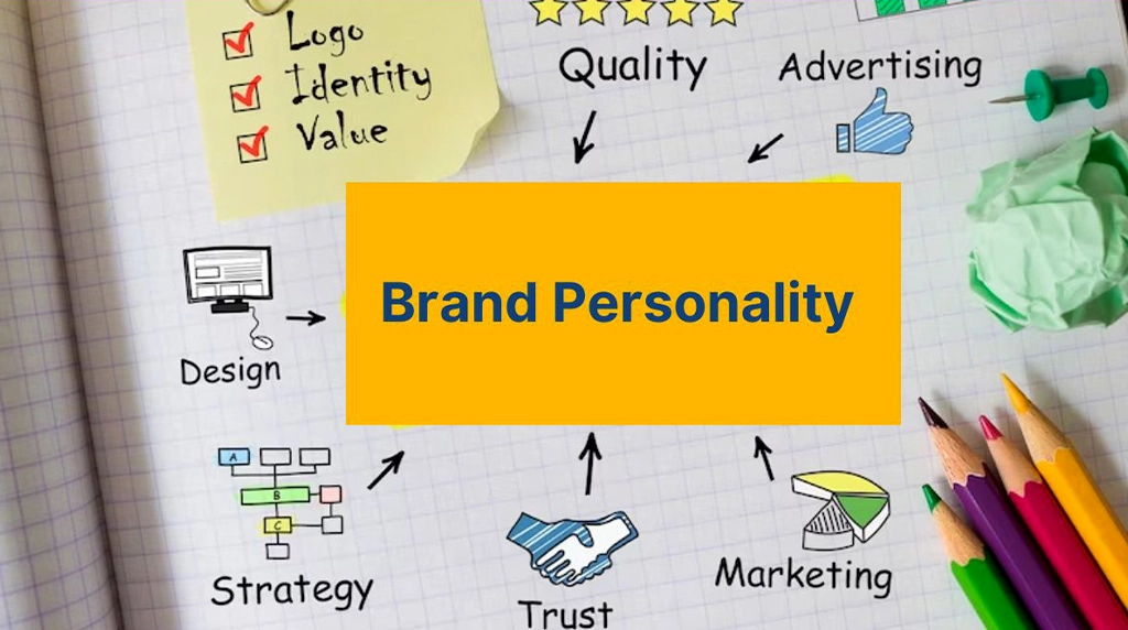
Colors contribute to the perception of the brand’s personality. For example, a luxury brand may have black, gold, or a deep purple, to speak sophistication, while a fun children’s brand may have bright yellows and oranges. With a simple, calculated choice of colors, a company can tell if it is professional, fun, energetic, cutting edge or reliable.
Enhancing Visual Hierarchy

Join Graphic Designing + AI Course
In graphic design, it is the color of color itself that leads and attracts the eyes of the viewer. Designers make key elements prominent, such as call to action buttons and headers, using contrasting colors. For example, a vivid red button on a mostly blue website stands out and grabs attention, promoting user interaction. Good color hierarchy allows the most critical information to stand out and lets the user and reader know what to focus on, improving both usability and user engagement.
Cultural and Regional Significance
Join Graphic Designing + AI Course
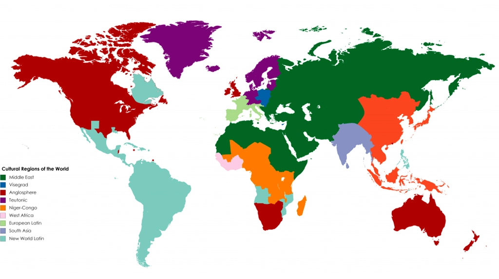
Colors signify different things in different cultures, which global brands need to take into consideration. Although white represents purity and peace in Western culture, it has ties to mourning in several Asian cultures. Equally, red is a lucky color in China but means danger, warning etc., in the West. International brands have to tweak their color palettes for regional appeal without getting their identity diluted as Mexican telenovelas flooding the U.S. airwaves have shown us.
Influencing Consumer Behavior

Join Graphic Designing + AI Course
Color has the power to influence consumers’ decisions. Certain colors can stimulate appetite, excitement or drowsiness, which might lead to making a purchase. For instance, food companies tend to opt for warm colors such as red and yellow that promote hunger, whereas banks and technology companies tend to use blue to convey a sense of security and reliability. In online sales, color testing (a/b testing) can determine which shades increase the click rate or conversion rate.
Creating Emotional Connection

Join Graphic Designing + AI Course
Brands that strategically employ colors can leave a lasting emotional impact on their audience. Colors activate memories, moods and emotive states making brand experiences stickier. Pastel shades in Instagram’s branding represent creativity and warmth, and invites the users to get involved. Emotional ties help solidify brand loyalty and also make consumers more likely to return.
Consistency Across Platforms

Join Graphic Designing + AI Course
Keeping the same color palette across every point of contact – website, social media, packaging, ads – is important for a unified brand feel. Imprecise colors can erode brand recognition and cause confusion among customers. Traditional graphic design programs can generate brand color specifications to help ensure that the selected color palette is used consistently, which helps to strengthen the brand’s visual identity and professionalism.
Conclusion
Join Graphic Designing + AI Course
Tones are not only visual elements in graphic design; they are also tools to create the identity of a brand, affect the behavior of consumers and influence emotionally. By taking into account the psychology of colors, their cultural implications and the basics of visual hierarchy, brands can communicate through colors, be noticed in the midst of so many others in the market and create enduring ties with their audience. Essentially, the right colors do more than just look good – they make a brand unforgettable.
https://www.youtube.com/watch?v=UuCuCcWNjR4
FAQs
Join Graphic Designing + AI Course
FAQ 1: Why are colors important in graphic design?
Colors are one of the first things people notice in any design. They attract attention, communicate emotions, and help deliver a message quickly. A good color combination makes a design more visually appealing, memorable, and effective in communicating with the audience.
FAQ 2: How do colors influence a brand’s identity?
Colors play a major role in building a brand’s personality. They help customers recognize a brand instantly and create emotional connections. For example, blue often represents trust and professionalism, while red conveys energy and excitement. Choosing the right colors helps a brand stand out in the market.
FAQ 3: Can the wrong color choices affect a design?
Yes. Poor color choices can make a design look unprofessional, reduce readability, and send the wrong message to the audience. Using too many colors or colors with low contrast can confuse viewers and weaken the overall impact of the design.
FAQ 4: How do professional designers choose the right color palette?
Professional designers begin by understanding the brand’s purpose, target audience, and industry. They use color theory, psychology, and harmony principles to select a balanced color palette. They also ensure the colors work well across digital platforms, print materials, and different screen sizes.
FAQ 5: What are some practical tips for using colors effectively in graphic design?
Keep your color palette simple and consistent. Use high contrast for better readability, maintain a clear visual hierarchy, and choose colors that match the brand’s message. Always test your design on different devices and consider accessibility so that everyone can easily understand and interact with your design.
Colors are one of the first things people notice in any design. They attract attention, communicate emotions, and help deliver a message quickly. A good color combination makes a design more visually appealing, memorable, and effective in communicating with the audience.
Colors play a major role in building a brand’s personality. They help customers recognize a brand instantly and create emotional connections. For example, blue often represents trust and professionalism, while red conveys energy and excitement. Choosing the right colors helps a brand stand out in the market.
Yes. Poor color choices can make a design look unprofessional, reduce readability, and send the wrong message to the audience. Using too many colors or colors with low contrast can confuse viewers and weaken the overall impact of the design.
Professional designers begin by understanding the brand’s purpose, target audience, and industry. They use color theory, psychology, and harmony principles to select a balanced color palette. They also ensure the colors work well across digital platforms, print materials, and different screen sizes.
Keep your color palette simple and consistent. Use high contrast for better readability, maintain a clear visual hierarchy, and choose colors that match the brand’s message. Always test your design on different devices and consider accessibility so that everyone can easily understand and interact with your design.